Thumbkiss
brand assets
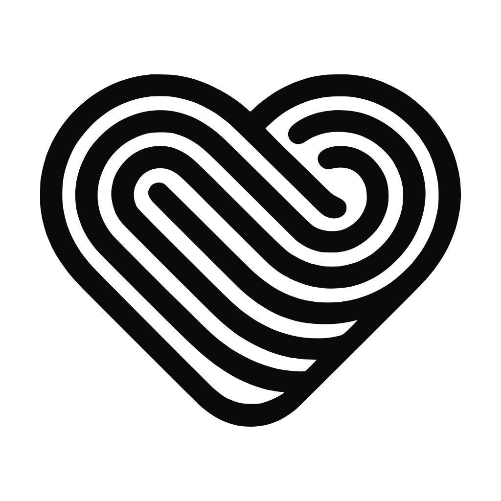
The official home of the Thumbkiss logo and design system. Thumbkiss is a private couple app for two people. Its mark is a fingerprint drawn as a heart, because a thumbkiss is what happens when two people press their thumbs to the same spot on a screen.
Everything here is free to download for press, app directories, review sites, creators and partners. Take the whole kit, or grab a single file.
01 The mark
Logo
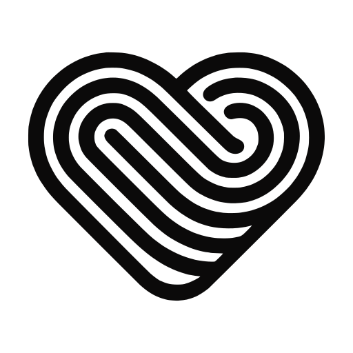
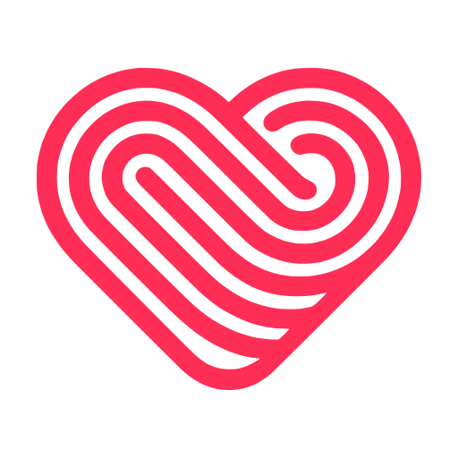
A single continuous line that spirals like a fingerprint and closes into a heart, drawn on a 512 × 512 grid with a uniform stroke and rounded terminals. Red is the default. White is for photography, video and dark surfaces. Black is for single colour print.

02 Logo with text
Lockups
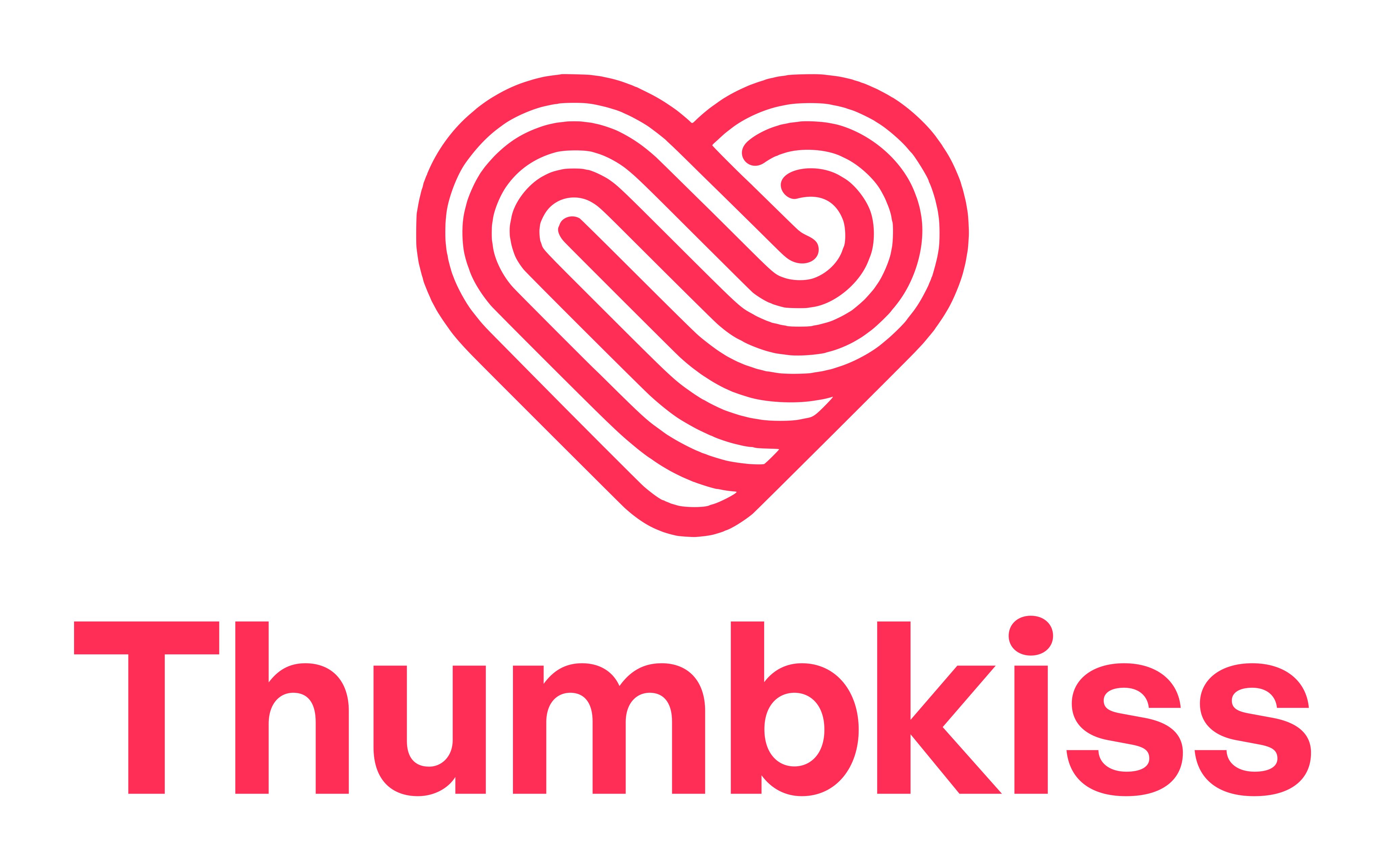
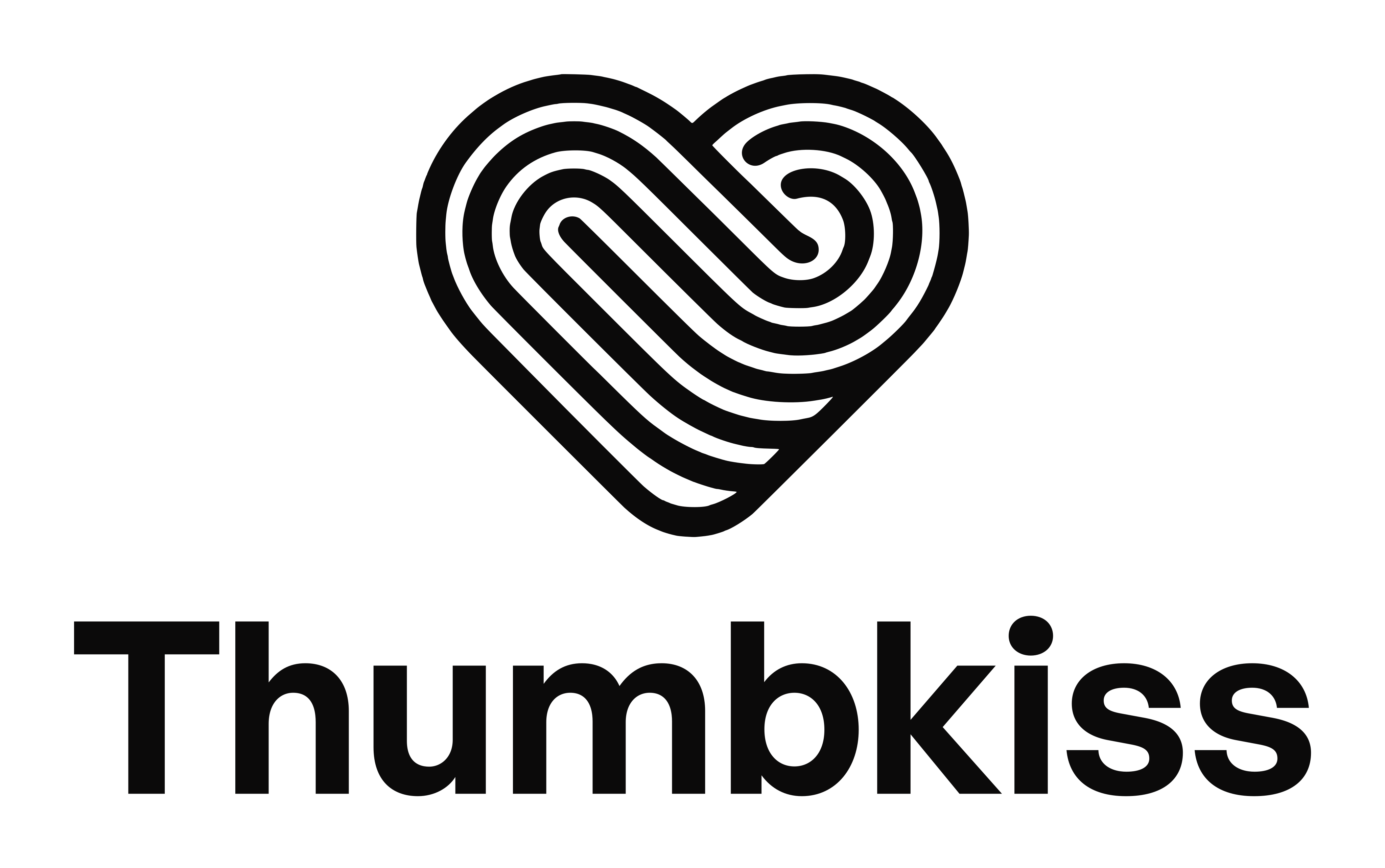
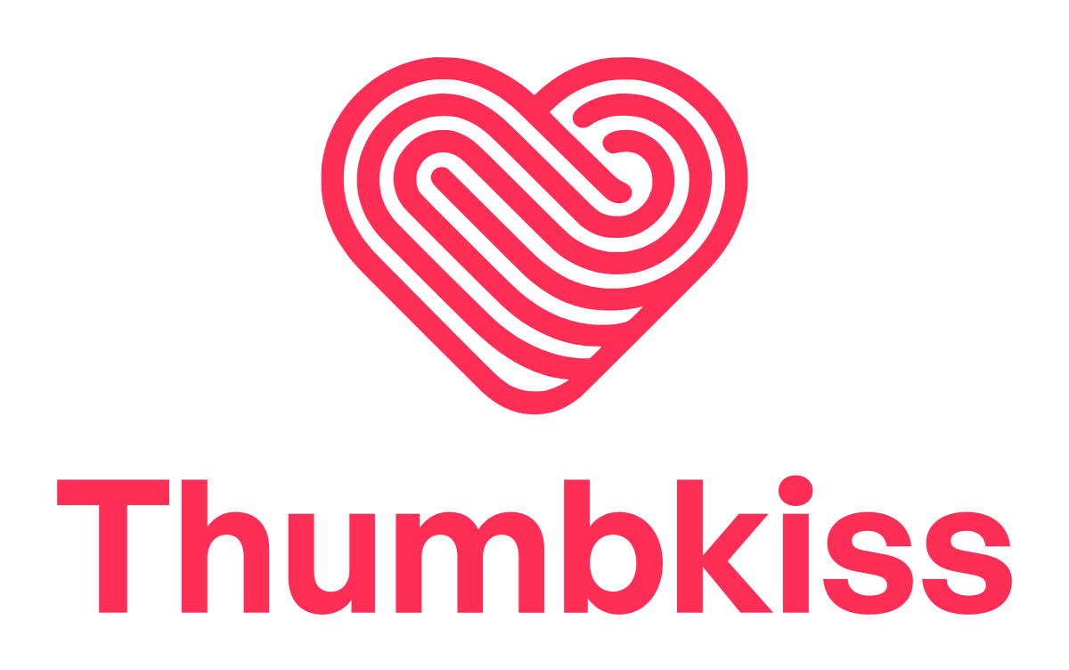
Use a lockup where the symbol alone would not be recognised: app stores, press articles, partner pages, sponsor walls. The wordmark is set in General Sans Semibold at −1.2% tracking and drawn as outlines, so it never depends on a font being installed.
Reach for the two tone horizontal version by default. Switch to single colour when the layout already carries another accent, when you print in one ink, or when the logo sits beside other partner logos. Use the stacked version only in roughly square space.
Horizontal

Stacked and wordmark

03 Share it
Badges
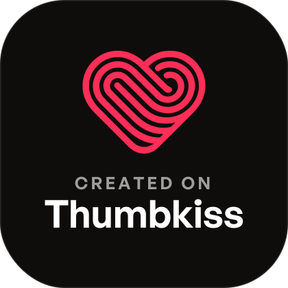
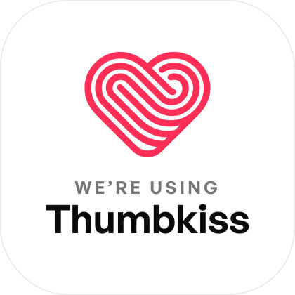
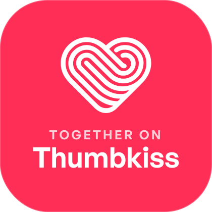
If you build something with Thumbkiss, use it with your partner, or write about it, these are yours. Put one on a screenshot, a photo, a story, a website footer or a README. Eight messages in four shapes, each in four styles: dark, light, Thumbkiss Red and a white outline that sits on any photo.
Pill







Sticker




Square stamp

Chip

All 76 badges, stickers, stamps and chips are in the kit. Link them back to thumbkiss.app wherever the medium allows links, and please do not edit the text or make your own variation.
<a href="https://thumbkiss.app" target="_blank" rel="noopener">
  <img src="https://thumbkiss.app/brand/thumbkiss-badge-created-on-dark.svg"
       alt="Created on Thumbkiss" height="34">
</a>
[](https://thumbkiss.app)
04 Product
App icon
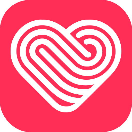
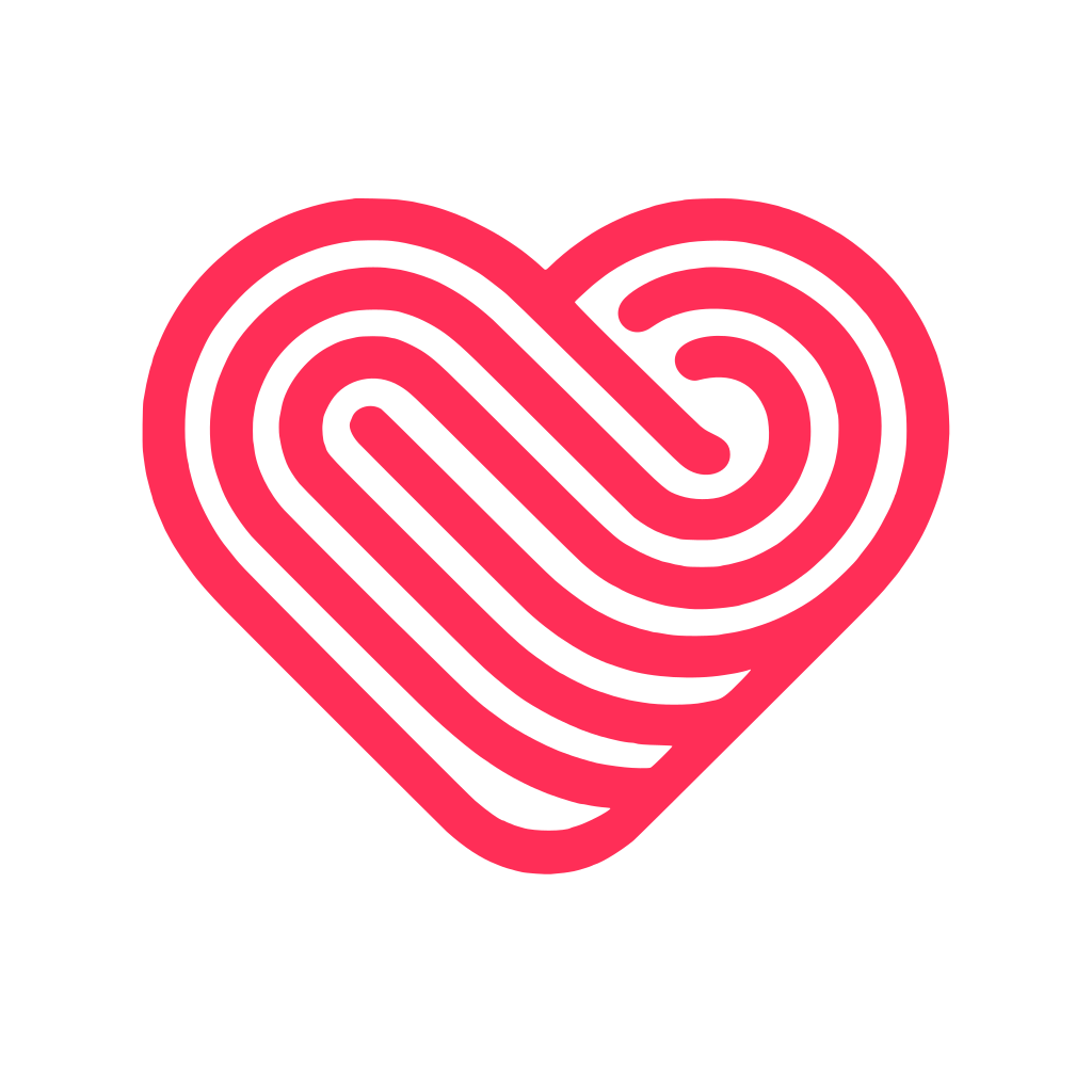
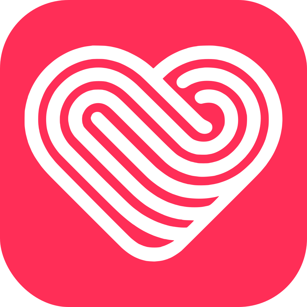
The icon that ships on the App Store and Google Play. Do not add your own rounded corners to the 1024 × 1024 master, because iOS and Android apply their own mask. Thumbkiss also ships alternate in app icons (Default, Gold, Diamond, Legend, Premium, LDR). Those are product features, not public brand assets.






























































05 Construction
Clear space
Keep a clear margin around the logo equal to 25% of the mark height on every side. Nothing enters that margin: no text, no other logos, no photo edge, no interface chrome.
| Context | Minimum size |
|---|---|
| Symbol on screen | 24 px height |
| Symbol in print | 8 mm height |
| Horizontal lockup on screen | 96 px width |
| Horizontal lockup in print | 28 mm width |
| Stacked lockup on screen | 64 px width |
| Pill badge on screen | 28 px height |
| Favicon or avatar | Use the red tile |
Below 24 px the inner spiral fills in. If you need the logo smaller than that, use the red tile, which is drawn to survive it.
06 Rules
Do and don’t
Do
✓Use the SVG whenever the medium supports it. It stays crisp at every size.✓Use white on any background darker than 40% luminance, and on photography.✓Scale from the corner, with the aspect ratio locked.✓Keep 25% of the mark height as clear space on all four sides.✓Write the name as “Thumbkiss”. One word, capital T, no space, no hyphen.
Don’t
✕Recolour the mark. Red, white or black only. No gradients, no pink.✕Add drop shadows, outlines, bevels, glows or strokes.✕Stretch, squash, rotate, skew or distort the logo.✕Rebuild a lockup, change the gap, or set the wordmark in another typeface.✕Place red on a red, pink or busy background where it loses contrast.✕Use the logo to imply that Thumbkiss endorses or sponsors you.
07 Colour
Palette
Thumbkiss Red is the one colour that has to be right. Everything else is a supporting neutral. Click a swatch to copy its hex.
#FFF1F4#FFE0E7#FFC2CE#FF94AB#FF5C7F#FF2E57#E31048#BE0A3D#9B0D37#800F33#470217#5A1F2BNeutrals
#080604#0F0C0C#0B0A0A#5A5560#8A8590#FFFFFFRed on white needs care
Thumbkiss Red on white measures 3.63:1. That passes WCAG AA for large text at 24 px
and up, for icons and for component borders, but it fails for body copy. On a light background, set links and
small text in Red 600 #E31048 at 4.74:1 or
Red 700 #BE0A3D at 6.36:1. On the dark
Thumbkiss background, red measures 5.44:1 and is safe everywhere.
| Pair | Ratio | Verdict |
|---|---|---|
#FF2E57 on #FFFFFF | 3.63:1 | Large text, icons, borders |
#E31048 on #FFFFFF | 4.74:1 | AA for all text |
#BE0A3D on #FFFFFF | 6.36:1 | AA everywhere, AAA large |
#FFFFFF on #FF2E57 | 3.63:1 | Large text and buttons |
#FF2E57 on #080604 | 5.44:1 | AA for all text |
#FFFFFF on #080604 | 20.23:1 | AAA |
08 Type
Typography
Two typefaces with separate jobs. General Sans is the brand and product face. It draws the wordmark and every pixel of the iOS and Android apps. Fraunces is the editorial face, used only for large headlines on the website and blog. Never swap their roles, and never add a third family.
General Sans
Wordmark, app interface, buttons, labels, in product body copy. Regular 400, Medium 500, Semibold 600, Bold 700. Free from Fontshare under the ITF Free Font Licence.
abcdefghijklmnopqrstuvwxyz
0123456789 & ? ! @ # %
Fraunces
Website and blog headlines only, 28 px and above. Optical sizing on, weight 600, tracking −1.5%. Never for interface labels, buttons or body copy. Free from Google Fonts under the SIL Open Font Licence.
abcdefghijklmnopqrstuvwxyz
0123456789 & ? ! @ # %
Scale
| Token | Size & line height | Family and weight | Use |
|---|---|---|---|
display-xl | 64 / 68 | Fraunces 600 | Landing hero |
display-lg | 48 / 54 | Fraunces 600 | Section headlines |
display-md | 32 / 38 | Fraunces 600 | Blog post titles |
title-lg | 24 / 30 | General Sans 600 | Card and screen titles |
title-md | 20 / 26 | General Sans 600 | Sub headings, sheets |
body-lg | 17 / 26 | General Sans 400 | Primary reading text |
body-md | 15 / 22 | General Sans 400 | Default interface text |
label | 13 / 18 | General Sans 500 | Buttons, tabs, chips |
caption | 12 / 16 | General Sans 500 | Timestamps, helper text |
overline | 11 / 14, +0.16em | General Sans 600 caps | Section tags |
09 System
Tokens
Spacing runs on a 4 px base. Radii are named by role rather than by pixel value, so a component keeps its personality when it is resized. Copy the CSS below, or take the tokens JSON.
:root {
  /* colour */
  --tk-red-500: #FF2E57;   /* Thumbkiss Red, the brand colour */
  --tk-red-600: #E31048;   /* text safe red on white, 4.74:1 */
  --tk-ink:     #0B0A0A;
  --tk-night:   #080604;

  /* type */
  --tk-font-brand:   'General Sans', 'Helvetica Neue', Arial, sans-serif;
  --tk-font-display: 'Fraunces', Georgia, serif;

  /* space, 4px base */
  --tk-sp-1: 4px;  --tk-sp-2: 8px;  --tk-sp-3: 12px; --tk-sp-4: 16px; --tk-sp-5: 24px;
  --tk-sp-6: 32px; --tk-sp-7: 48px; --tk-sp-8: 64px; --tk-sp-9: 96px; --tk-sp-10: 128px;

  /* radius */
  --tk-r-sm: 8px; --tk-r-md: 14px; --tk-r-lg: 22px; --tk-r-xl: 32px; --tk-r-pill: 999px;

  /* motion */
  --tk-motion-fast: 160ms ease-out;
  --tk-motion-base: 240ms cubic-bezier(.2,.8,.2,1);
}
Spacing
| Token | Value | Use |
|---|---|---|
sp-1 | 4 px | Icon to label gap |
sp-2 | 8 px | Inside chips |
sp-3 | 12 px | Between related lines |
sp-4 | 16 px | Card padding, list rows |
sp-5 | 24 px | Between cards |
sp-6 | 32 px | Screen edge padding |
sp-7 | 48 px | Between subsections |
sp-8 | 64 px | Between sections |
sp-9 | 96 px | Web section rhythm |
sp-10 | 128 px | Hero padding |
Radius, elevation, motion
| Token | Value | Use |
|---|---|---|
r-sm | 8 px | Inputs, small chips |
r-md | 14 px | Buttons, list rows |
r-lg | 22 px | Cards, sheets |
r-xl | 32 px | Modals, hero panels |
r-pill | 999 px | Pills, badges, CTAs |
r-squircle | 22.37% | App icon tiles |
elev-1 | 0 1px 2px rgba(0,0,0,.24) | Resting card |
elev-2 | 0 8px 24px rgba(0,0,0,.32) | Sheet, popover |
elev-glow | 0 0 40px rgba(255,46,87,.35) | Thumbkiss pulse |
motion-fast | 160 ms ease out | Taps, toggles |
motion-base | 240 ms cubic bezier | Transitions |
motion-heart | 720 ms spring | Thumbkiss send |
10 Legal
Usage
The Thumbkiss name, logo, badges and app icon are trademarks of Thumbkiss. You may use the assets on this page, unmodified, to refer to the Thumbkiss app in editorial articles, reviews, app directories, comparison pages, social posts and academic work. You may not use them to suggest endorsement, to brand your own product, or as part of another logo. Questions go to hello@thumbkiss.app.
Where can I download the Thumbkiss logo?
Every official version is on this page. Download them individually as SVG, PNG or WebP, or take the complete kit. This page is the only official source. Files found elsewhere may be outdated or unofficial.
What colour is the Thumbkiss logo?
Thumbkiss Red, #FF2E57, rgb(255, 46, 87).
The logo also ships in pure white for dark backgrounds and in black
#0B0A0A for single colour print.
What font does Thumbkiss use?
The wordmark and the entire app interface are set in General Sans by Indian Type Foundry, free from Fontshare. The website and blog use Fraunces for display headlines only.
Can I put a Created on Thumbkiss badge on my post?
Yes. That is what the badges are for. Use them unmodified on screenshots, photos, stories, videos, websites and READMEs, and link back to thumbkiss.app where the medium allows links.
Can I use the Thumbkiss logo in my article or app directory?
Yes. Use the unmodified files from this page when you write about, review or list the Thumbkiss app. Keep the required clear space, and do not imply that Thumbkiss endorses you.
What does the Thumbkiss logo mean?
It is a fingerprint drawn as a heart. A thumbkiss happens when two partners press their thumbs to the same spot on their screens and both phones respond. The mark fuses the most personal thing a person has, their fingerprint, with the shape of the feeling behind it.